2023 Visualize This! Contest
Last Friday (Sep-15) we launched the Visualize This! Contest.
Who are we?
We are the Alliance’s National Visualization Team comprised of HPC analysts from the Alliance’s regional partners (ACENET, Calcul Québec, Compute Ontario) and universities in Western Canada (SFU, Univ of Alberta, Univ of Calgary).
- Hosted by the Digital Research Alliance of Canada and its regional / institutional partners
Now in its 6th year
- 2023: Halloween storm over Eastern Canada and the Normalized difference vegetation index
- 2020-2021:
Earth’s Mantle Convection
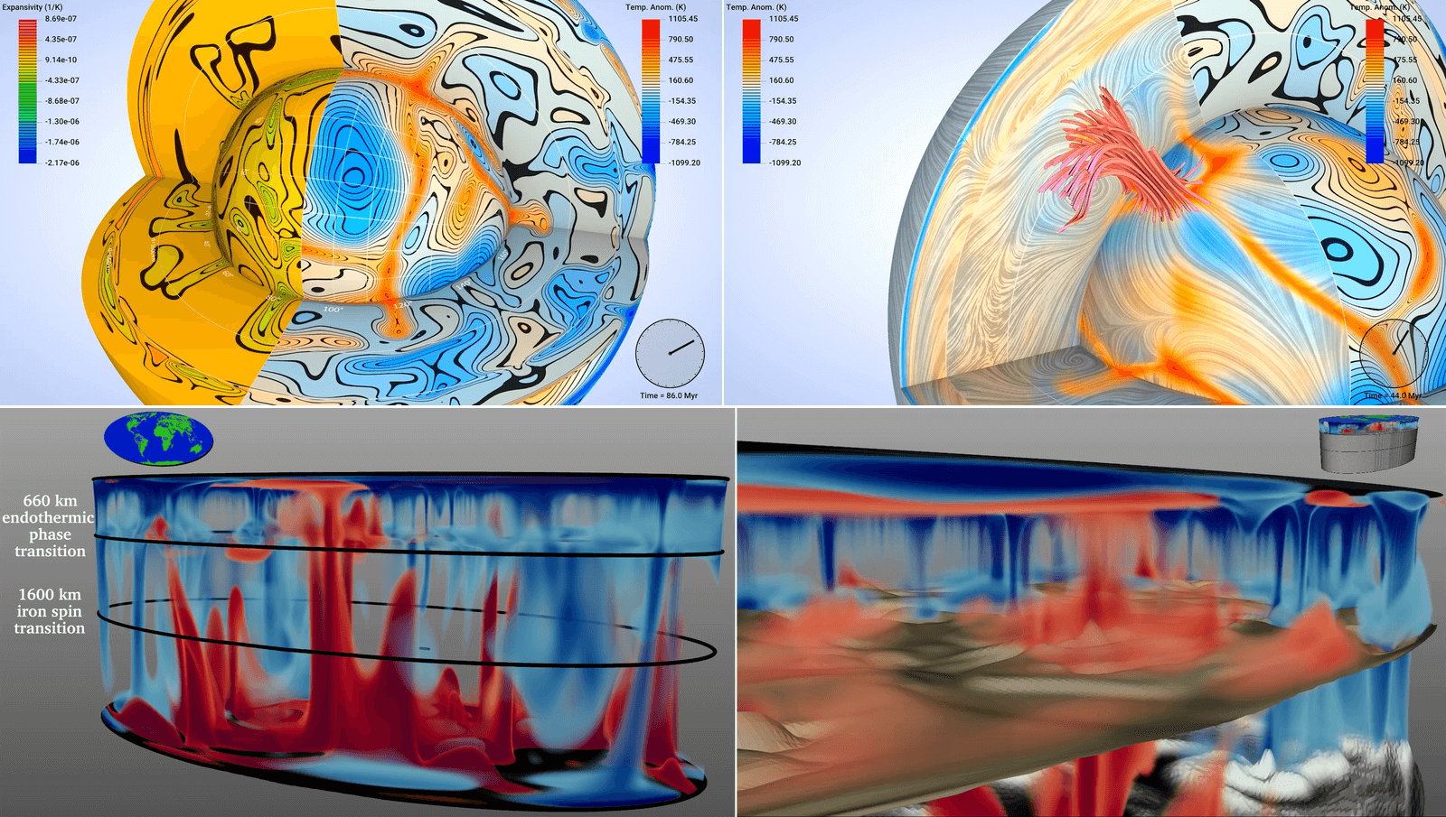
Figure 1: In 2020-2021 we partnered with IEEE Vis to host the international 2021 SciVis Contest
- 2019: Incompressible transitional air flow over a wind turbine section or bring your own data
- 2018: Interaction of a large protein structure with a cell’s membrane and Linked humanities data
- 2017: Airflow around counter-rotating wind turbines
- 2016: Visualizing multiple variables in a global ocean model
Why we host these contests
- Train: popularize and teach open-source software visualization tools and techniques that researchers can apply to their own data. We regularly teach visualization workshops and courses, and we find that a visualization contest is a perfect venue for early-career researchers to learn these tools and sharpen their data analysis skills.
- Outreach: tell all Canadian academic researchers about our visualization support, including support@tech.alliancecan.ca and your local/regional HPC support.
- Learn: see novel visualization ideas, learn from you.
Who can participate
Targeting primarily graduate students and postdocs from Canadian universities, but anyone can participate irrespective of their affiliation or career stage.
Contest terms
Please read our Contest terms before sending us your work.
- Only use open-source (not proprietary or commercial) tools so that anyone can reproduce your visualization.
- Your submission may be published on our website and in other communication materials, with all credits preserved.
Don’t be afraid to experiment! With 3D visualization I usually find the interactive data exploration process a lot of fun, and the more you play with the data, the more ideas you typically have. We expect that most participants will be absolute beginners with 3D visualization, so the idea is to learn in the process.
Datasets
You can work on one of two datasets:
- both datasets contain Canadian geospatial data: one from a numerical simulation, and the other compiled from several empirical sources
- both are available for downloading now
- both can be visualized on personal computers (no need for HPC)
- Simulation of a storm over Eastern Canada
- more difficult, involves multiple overlapping 3D scalar fields
- data kindly provided by Alejandro Di Luca and François Roberge from l’Université du Québec à Montréal
- simulation was conducted using the Alliance’s Narval cluster
Figure 2: Distribution of clouds (white), rain (green to cyan), and ice crystals (yellow) over 6 days starting with the storm on October 31, 2019.
- Normalized difference vegetation index (NDVI) over BC throughout 2022
- less complex, almost 2D data
- data kindly provided by Michael Noonan and Stefano Mezzini from the University of British Columbia at Okanagan
Figure 3: NDVI as a function of time for BC.
Timeline
- 2023-Sep-15 – contest announcement, datasets published
- 2023-Sep-19 – today’s webinar
- December 10th, midnight Pacific Time – submission deadline
- Mid- to late December – review of submissions
- Early January 2024 – announcement of results
For more information
- Contest website https://visualizethis.netlify.app (English) and https://visualizethis.netlify.app/fr (French)
- For quick questions about the Contest, use this form
- Join the 2023 Visualize This! Google group; to read and post messages, please register your interest in the Contest, and we will add you to the group
Let’s take a look at the data!
Dataset 1: simulation of a storm over Eastern Canada
Let’s load the data in Python:
- len(data.time) = 24 inside each 3D file
- (rlat, rlon) are the coordinates in the rotated grid used by the model
- the geographical coordinates lon(rlat, rlon) and lat(rlat, rlon) are inside the data files
- type(data.lon.values)
- data.MPQR.values.shape = (24, 16, 1060, 1330)
Let’s check an example of a complete workflow a14.py in ParaView. This file is not shared with the participants.
Let’s create a flat topography file in ParaView:
- load the land-sea mask MG(rlat,rlon) from
pm2015090100_00000000p.nc, selecting (rlat,rlon) variables - load the topographical elevation ME(rlat,rlon) from
dm2015090100_00000000p.nc, selecting (rlat,rlon) variables - apply Append Attributes to both
- apply Calculator: elevation = MG*ME
- apply the Programmable Filter Output Type = vtkImageData
ext = inputs[0].GetExtent()
elevation = inputs[0].PointData["elevation"]

output.SetOrigin(0., 0., 0.)
output.SetSpacing(1., 1., 3.)
output.SetDimensions(ext[1]-ext[0]+1, ext[3]-ext[2]+1, ext[5]-ext[4]+1)
output.SetExtent(ext)
output.AllocateScalars(vtk.VTK_FLOAT, 1)

vtk_data_array = vtk.util.numpy_support.numpy_to_vtk(elevation, deep=True, array_type=vtk.VTK_FLOAT)
vtk_data_array.SetNumberOfComponents(1)
vtk_data_array.SetName("elevation")
output.GetPointData().SetScalars(vtk_data_array)
- apply Threshold to throw away 0<elevation<0.1
- last object | Save Data as
topo.pvd - optionally apply Warp by Scalar coeff=0.003
You can visualize everything in curved / spherical coordinates. Here is an example for a 3D array:
- load the mass mixing ratio of cloud
MPQC(time,pres,rlat,rlon)fromdp2015090100_20191101d.nc, selecting (pres,rlat,rlon) variables and usingvertical scale = 1andvertical bias = 1e4to force a narrow radial section - try Surface 🡒 can’t see anything …
- try Volume representation 🡒 very, very slow … trying to do ray tracing in curved geometry
- Isosurface might work in this geometry 🡒 try a range on a log scale
If instead you prefer to transition to a flat geometry (much faster in Volume representation), here is how you could do it with a 3D array:
- load the mass mixing ratio of cloud
MPQC(time,pres,rlat,rlon)fromdp2015090100_20191101d.nc, selecting (pres,rlat,rlon) variables; vertical scale/bias are not important here - apply the Programmable Filter Output Type = vtkImageData
ext = inputs[0].GetExtent()
mpqr = inputs[0].PointData["MPQR"]

output.SetOrigin(0., 0., 0.)
output.SetSpacing(1., 1., 9.)
output.SetDimensions(ext[1]-ext[0]+1, ext[3]-ext[2]+1, ext[5]-ext[4]+1)
output.SetExtent(ext)
output.AllocateScalars(vtk.VTK_FLOAT, 1)

vtk_data_array = vtk.util.numpy_support.numpy_to_vtk(mpqr, deep=True, array_type=vtk.VTK_FLOAT)
vtk_data_array.SetNumberOfComponents(1)
vtk_data_array.SetName("rain")
output.GetPointData().SetScalars(vtk_data_array)
- apply Contour at 0.0001
- make all white
- also show the Volume representation
Plotting all timesteps inside a single NetCDF file
In the previous visualization, let’s go back to Contour at $10^{-4}$. Also show the outline. Use “Play” button to play it back. How can you save this animation.
Traditional approach:
- File | Save Animation… as PNG images
- use ffmpeg command-line utility to merge them into a movie at let’s say 10fps
Scripting approach:
- File | Save State… as a Python code
animOneDay.py - You can even test it via File | Load State… to make sure everything looks good
- Edit this Python code:
a. look for the line withdp2015090100_20191031dnc = NetCDFReader
b. renamedp2015090100_20191031dnctodataeverywhere in the script
c. remove any existingSaveScreenshot
d. add the following near the end of your script:
time = data.TimestepValues
print(time)
for t in time:
    print("processing step", t)
    data.UpdatePipeline(t)
    renderView1.ViewTime = t
    SaveScreenshot('/path/to/frame%04d'%(t)+'.png', renderView1, ImageResolution=[1920, 1080])
- Run the script:
pvpython animOneDay.py
Challenge: visualize multiple 3D fields and their relative positions
- use different colour maps for different variables
- avoid overlapping and too much data in one plot
- use different representations for different variables
Check out Tasks.
Dataset 2: NDVI over BC
Presenter: play back ~/Documents/09-visualizeThisWebinar/mu_both.mp4. This file is not shared with the
participants.
Let’s load the CSV data in Python:
- each row is a data point, no underlying mesh
Let’s load the VTK data in ParaView
- each point has three variables: elev, NDVI $\mu$ , and its variance $\sigma_2$
- use Point Gaussian representation with a plain circle, adjust radius
- colour by NDVI
- switch to the blue-to-brown-to-green NDVI colour map
Let’s load the CSV data in ParaView – this takes a while. Pass the data through the Table To Points filter.
Suggestions
Check out Tasks.